Introduction
In our UI, we use Tailwind CSS as the foundation for our styles. If you're already familiar with it, using our UI will be straightforward.
If you're not familiar with Tailwind CSS, we recommend checking out its documentation to understand how it works.
If you've set up your project following the installation guide, you can now use the default color classes.
<span className="bg-primary text-secondary-50 p-4 rounded-xl">Hello world</span>Result:
Hello worldColor Palette
Within pol-ui, we have 6 main colors, each with a maximum of 10 shadows that adapt to your project's styles using the theme.extend.colors property.
These colors are:
- primary: The main color of the website.
- secondary: Secondary color, used for backgrounds, non-important elements, shadows, etc.
- success: Color for successful elements.
- warning: Color for user warnings.
- error: Color for elements with program consequences.
- info: Color for highlighting user notices.
The examples in this documentation use the default colors, but you can change them in your tailwind.config.js file.
  primary: '#B49CFF',
  secondary: '#BFBFBF',
  success: '#4CAF50',
  warning: '#FFC107',
  error: '#F44336',
  info: '#2196F3',
Primary
Secondary
Success
Warning
Error
Info
You can extend your project's color palette without affecting pol-ui using the theme.extend.colors property. For example, adding a purple color:
// tailwind.config.js
module.exports = {
  theme: {
    extend: {
      colors: {
        // ... existing colors
        purple: "#B49CFF",
      },
    },
  },
};
Similarly, you can extend keyframes, animations, shadows, etc. Feel free to modify them as you prefer.
Color Shadows
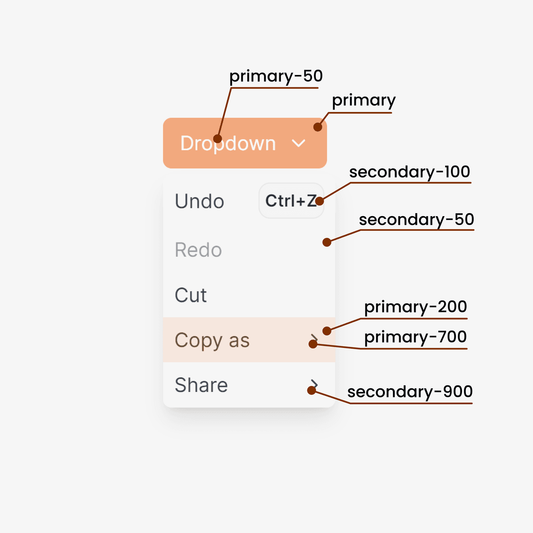
The UI configuration in Pol-ui is based on a main color and 10 shadows that adapt to that color.
The main color corresponds to shadow 500, and shadows range from 100 to 900.
To add a new color like purple in Pol-ui, you can do it this way:
// tailwind.config.js
module.exports = {
  theme: {
    extend: {
      colors: {
        // ... los colores que ya existen
        purple: {
          DEFAULT: "#8864FF",
          50: "#F5F3FF",
          100: "#EDE9FF",
          200: "#D4CFFF",
          300: "#BBA6FF",
          400: "#A27DFF",
          500: "#8864FF",
          600: "#6D4BFF",
          700: "#5532FF",
          800: "#3C19FF",
          900: "#2300FF",
        },
      },
    },
  },
};
Why do we use shadows?
We always use shadow 500 for the main color, and other shadows for elements as needed.

In this Dropdown, the main color is primary, and shadows adapt to that color. All pol-ui components use this configuration internally. You can use these colors in your own components or extend them as needed.
Typography
Pol-ui is not opinionated about typography; it adapts to your project's choice.
Local Typography
For vanilla or React projects with Vite, the recommended way to use a font is to use a local one. Add your font to your project and use it in your globals.css.
@layer base {
  @font-face {
    font-family: "YourFont";
    src: url(./YourFont) format("woff2");
    font-weight: 100 200 300 400 500 600 700 800 900;
    font-display: swap;
  }
  html {
    font-family: "YourFont", sans-serif;
  }
}
This configuration is for using this font with Tailwind CSS.
@layer base {
  html {
    font-family: "YourFont", sans-serif;
  }
}
Google Fonts Typography
Google Fonts provides a CDN link for easy use, but it's not recommended due to potential performance and privacy issues.
If you still want to use it, add the link to your index.html and use it in your globals.css.
Google Fonts in Next.js
For Next.js projects, it's recommended to use Google Fonts as it downloads the font internally, not affecting your website's performance. Use the official next-google-fonts package and follow their instructions.